Data is the Star
With software, you want your data to be the star, not unimportant design elements that are distracting to the eye.
In January 2016 we are updating Pacific Timesheet’s UI (user interface).
While your systems will look a lot nicer and be more pleasing to the eye, there are some important technical and usability reasons for the update.
Simpler Flatter Design
In recent years, there has been a movement toward more simple and so-called “flat” design. The overall rationale behind this is that simpler is better.
Technically speaking there are subtle but critical reasons for this:
- Excessive color, shading, gradients and rounded corners require bandwidth:
You might have noticed that the trend in website and web-based application design has been to get leaner and simpler. Excessive UI elements, that add no value to the user experience, except making things look fancy or “design-y”, are now considered bad because they hurt system performance and slow down the delivery and update of web-based pages. This is true for any mobile, tablet or desktop device. The philosophy here: if there is any way to “flatten out” the UI, squeeze out anything that is not crucial to the presentation of data on any screen, you should do it.
- Excessive design elements distract the eye from your system data:
The other major reason to simplify design is one of information architecture. We do not want your eyes needlessly drawn to rounded corners, shading, obtrusive colors, or other design elements. We visually don’t want the most important data on any screen playing second fiddle. In other words, on a timesheet, the employee’s hours are the star, not a menu bar or the box containing the hours. Accordingly, you will notice that background elements such as containers, boxes and lines have become more gray scale and lighter. This has the effect of making your data, project names, hours, notes and other time, work and asset entry data, really stand out on the screen.
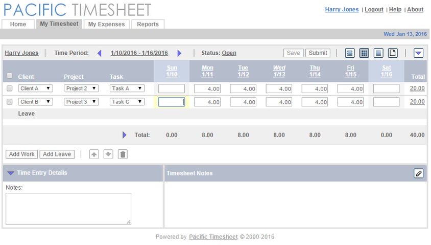
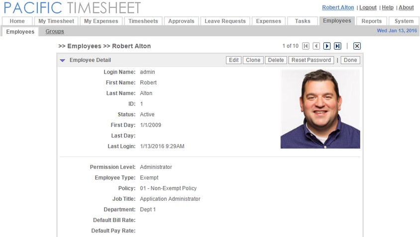
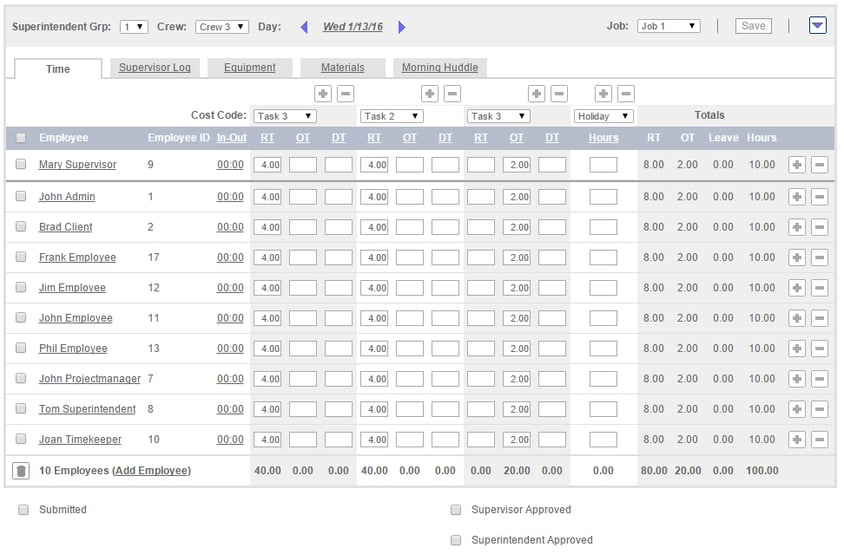
Here are some sample screens in the new update:
My Timesheet Sample

Employee Profile Sample

Crew Timesheet Sample

Asset Entry Screen Sample
So how will this update be important for you and your users?
You should notice that the performance of various pages will perform better, with faster loads and quicker refreshes.
You should also notice that user data should pop and be a lot more prominent on any screen.
System Notice on Home Page
Your users will see a system notice of the upcoming UI change, so there is no need to notify them of the update, unless you would like to. This update will not change any features or the way the system functions. In general, you should expect that data and elements will be easier for users to see and you should not receive complaints about the change because it affects users' features or their use of the system.
Feedback
However, if there are any user comments about the change that you would like to pass along to us, please do so in the comments area below, or you can always email your customer relationship manager or Pacific Timesheet Support at support@pacifictimesheet.com.
Your opinion as a system administrator is also very important to us. Please let us know what you think about the UI update. We appreciate any feedback.


